JobData
Project description: Personal python data analytics notebook from October 2025.
Dataset: 3000 jobs scraped with JobScraper within July-October 2025
Analysis of ~3,000 Jobs from LinkedIn and Glassdoor (Last 3 Months)
PS: this is a Part 2 of my Linkedin Post about job market.
Spec:
- Job Title: Frontend Developer/Engineer or Fullstack Developer Engineer
- Location: Munich hybrid or Remote
- Sources: LinkedIn, Glassdoor
import pandas as pd
import matplotlib.pyplot as plt
import re
import numpy as np
import math
import seaborn as sns
Notebook Presentation
pd.options.display.float_format = '{:,.0f}'.format
pd.set_option('display.width', 400)
pd.set_option('display.max_columns', 10)
Read the Data
df = pd.read_csv('../tmp/csv/Scraped_Jobs.csv')Explore
#df.shape
#df.head()
#df.tail()
df.info()
df.sample(5)
<class 'pandas.core.frame.DataFrame'>
RangeIndex: 2966 entries, 0 to 2965
Data columns (total 18 columns):
# Column Non-Null Count Dtype
--- ------ -------------- -----
0 job_id 2966 non-null int64
1 job_title 2966 non-null object
2 job_link 2966 non-null object
3 company_name 2966 non-null object
4 company_rating 1147 non-null float64
5 location 2928 non-null object
6 salary_estimate 333 non-null object
7 job_age 2966 non-null object
8 job_age_days 2966 non-null int64
9 job_hours 0 non-null float64
10 first_scraped_date 2776 non-null object
11 last_scraped_date 2943 non-null object
12 filter 1820 non-null object
13 promoted 1492 non-null object
14 platform 2966 non-null object
15 status 2733 non-null object
16 comment 869 non-null object
17 source 2966 non-null object
dtypes: float64(2), int64(2), object(14)
memory usage: 417.2+ KB| job_id | job_title | job_link | company_name | company_rating | … | promoted | platform | status | comment | source | |
|---|---|---|---|---|---|---|---|---|---|---|---|
| 619 | 4308011925 | Javascript Frontend Engineer with verification | https://www.linkedin.com/jobs/view/4308011925/… | Amber | - | … | False | discarded | games emea | LN frontend DE, LN frontend MUC | |
| 1091 | 4307218977 | Senior Fullstack Engineer with verification | https://www.linkedin.com/jobs/view/4307218977/… | FAIRTIQ | - | … | True | new | - | LN fullstack DE, LN fullstack MUC | |
| 1515 | 4312086611 | Fullstack Engineer (Web3) | https://www.linkedin.com/jobs/view/4312086611/… | Kiln | - | … | False | new | - | LN fullstack DE, LN fullstack MUC | |
| 2854 | 4298597780 | (Senior) Fullstack Developer (f/m/d) | https://www.linkedin.com/jobs/view/4298597780/… | plancraft | - | … | False | new | - | LN fullstack DE, LN fullstack MUC | |
| 1858 | 4310295685 | Fullstack Entwickler - Java / Kotlin / Angular… | https://www.linkedin.com/jobs/view/4310295685/… | Optimus Search | - | … | True | new | - | LN fullstack MUC |
5 rows × 18 columns
Job Titles
Cleanup
But first lets remove duplicate job entries (reposted jobs under new IDs).
e.g OPED posted same ‘Fullstack Developer Python/ React (f/m/d) - remote’ job 75 times within last 3 months
before = len(df)
df.drop_duplicates(subset=['job_title', 'company_name'], keep='first', inplace=True)
after = len(df)
print(f"removed {before - after} jobs")
# removed 898 jobs
Now, let’s break down job titles by category.
1. by name (Developer vs Engineer vs Entwickler)
PS: ‘Entwickler’ is the German translation for ‘developer’.
Why?: Whether or not you read [The Great Divide] omitting a common job title term can significantly affect the number of jobs found. Another reason: While multiple articles suggest Engineers receive higher salaries, my relatively small dataset (see Salary Section) couldn’t confirm this difference.
categories = {
    'Backend': r'back',
    'Frontend': r'front',
    'Devops': r'devops',
    'QA': r'QA|quality|automation|cloud',
    'Fullstack': r'fullstack|full stack|full-stack'
}

job_exp_counts = {
    label: df['job_title'].str.contains(pattern, case=False, na=False).sum()
    for label, pattern in categories.items()
}

exp_counts_series = pd.Series(job_exp_counts)

plt.figure(figsize=(8, 6))

plot_data = exp_counts_series.sort_values(ascending=False)
num_colors = len(plot_data)
colors = sns.color_palette('viridis', n_colors=num_colors)
bars = plot_data.plot(kind='bar', color=colors)

for i, count in enumerate(plot_data.values):
    plt.text(i, count + max(plot_data.values)*0.01, str(count), ha='center', va='bottom', fontsize=10)

plt.title('Number of Jobs by Expertise', fontsize=16)
plt.xlabel('Area of Expertise', fontsize=14)
plt.ylabel('Number of Jobs', fontsize=14)
plt.xticks(rotation=0)
plt.grid(axis='y', linestyle='--', alpha=0.7)
plt.tight_layout()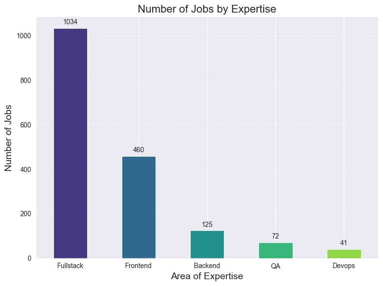
That’s the reason why I decided that Fullstack transition is a way. Job market is twice as bigger.
However, Fullstack roles also involve a much wider technology spread (Node, Java, PHP, .NET, Go, etc.).
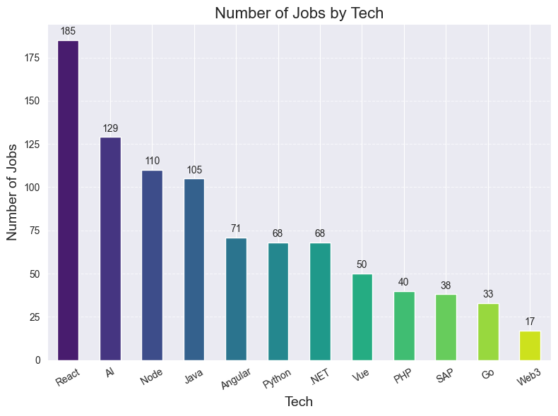
2. by technology
categories = {
    'React': r'react',
    'Vue': r'vue',
    'Angular': r'angular',
    'Java': r'\bjava\b',
    'Web3': r'web3',
    'PHP': r'php',
    'Python': r'python',
    '.NET': r'python',
    'AI': r'AI|LLM',
    'SAP': r'SAP',
    'Go': r'\bgo|golang\b',
    'Node': r'node',
}

job_tech_counts = {
    label: df['job_title'].str.contains(pattern, case=False, na=False).sum()
    for label, pattern in categories.items()
}

tech_counts_series = pd.Series(job_tech_counts)

plt.figure(figsize=(8, 6))

plot_data = tech_counts_series.sort_values(ascending=False)
num_colors = len(plot_data)
colors = sns.color_palette('viridis', n_colors=num_colors)
bars = plot_data.plot(kind='bar', color=colors)

for i, count in enumerate(plot_data.values):
    plt.text(i, count + max(plot_data.values)*0.01, str(count), ha='center', va='bottom', fontsize=10)

plt.title('Number of Jobs by Tech', fontsize=16)
plt.xlabel('Tech', fontsize=14)
plt.ylabel('Number of Jobs', fontsize=14)
plt.xticks(rotation=30)
plt.grid(axis='y', linestyle='--', alpha=0.7)
plt.tight_layout()
As shown, the number of React jobs surpasses Angular and Vue combined.
But Java + Angular often come together and are therefore also a strong pick.
PS: keep in mind that these are only the jobs containing term in the title. But, given that I’ve applied to almost every Vue job I found, I can assure you that the real amount is not that far from the above extrapolation.
Which you can find here https://www.linkedin.com/pulse/i-applied-236-jobs-frontend-developer-germany-since-march-schmidt-pihuf/#ember545 (156 React vs 60 Vue)
Source Performance and Redundancy
LinkedIn and Glassdoor searches are far from perfect.
LinkedIn allows to use logical operators like ‘“Full Stack Engineer” OR “fullstack” OR “node.js”’, but still I had to use 4 different feeds to check for frontend/fullstack and munich hybrid/remote.
Glassdoor is even worse, there I had to use 10 different feeds.
Lets see how many jobs were unique to each feed.
unique_jobs_agg = df.groupby(['job_title', 'company_name']).agg(
    full_source_string=('source', lambda x: ', '.join(x.astype(str).unique())),
    job_id=('job_id', 'first'),
).reset_index()

source_df = unique_jobs_agg.assign(
    source=unique_jobs_agg['full_source_string'].str.split(', ').apply(lambda x: [s.strip() for s in x])
).explode('source')

job_source_count = source_df.groupby('job_id')['source'].nunique().reset_index(name='Total_Sources_Per_Job')

source_df = source_df.merge(job_source_count, on='job_id')


source_analysis = source_df.groupby('source').agg(
    Total_Jobs=('job_id', 'count'),
    Unique_Only_Jobs=('Total_Sources_Per_Job', lambda x: (x == 1).sum())
).reset_index()


source_analysis['Exclusivity_Ratio'] = (
    source_analysis['Unique_Only_Jobs'] / source_analysis['Total_Jobs']
) * 100

source_analysis.sort_values(by='Exclusivity_Ratio', ascending=False, inplace=True)
source_analysis = source_analysis.round(2)

plot_data = source_analysis.sort_values(by='Exclusivity_Ratio', ascending=False)

plt.figure(figsize=(10, 6))

bars = sns.barplot(
    x='Exclusivity_Ratio',
    y='source',
    hue='source',
    data=plot_data,
    palette='viridis'
)

for i, (ratio, total_jobs) in enumerate(zip(plot_data['Exclusivity_Ratio'], plot_data['Total_Jobs'])):
    bars.text(ratio / 2, i,
              f'{ratio:.1f}%',
              color='white', ha='center', va='center', fontsize=11, fontweight='bold')

    bars.text(ratio + 0.5, i,
              f'({total_jobs} total)',
              color='black', ha='left', va='center', fontsize=10)

plt.title('Source Performance: Unique Jobs Exclusivity', fontsize=16, fontweight='bold')
plt.xlabel('Exclusivity Ratio (% of Jobs Found ONLY in this Source)', fontsize=12)
plt.ylabel('Job Source', fontsize=12)
plt.xlim(0, plot_data['Exclusivity_Ratio'].max() + 10)
plt.tight_layout()
plt.show()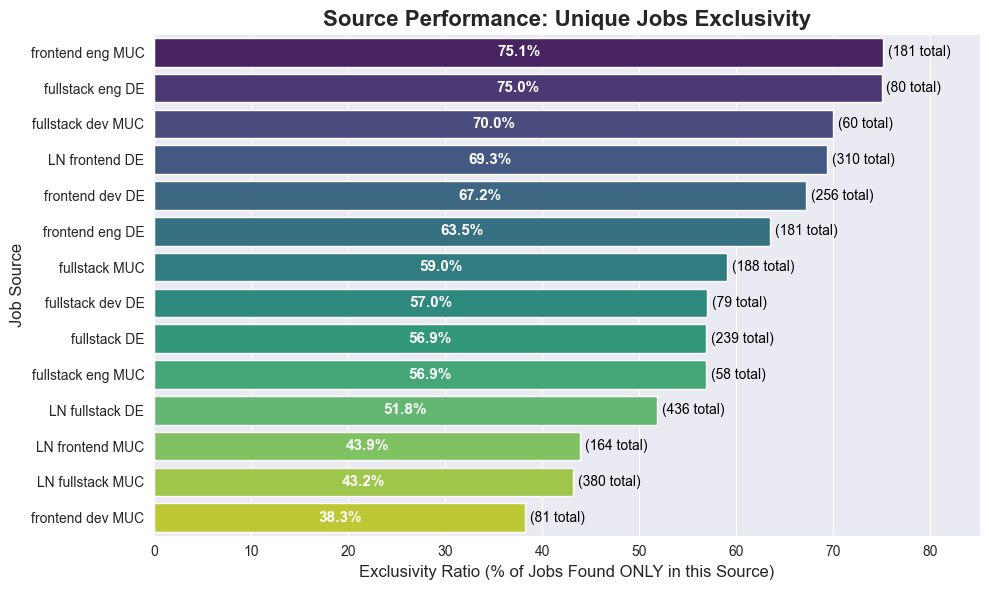
Observation: LinkedIn feeds appear to contribute fewer unique jobs (likely due to my specific logical filters and broad Glassdoor coverage), but there is no clear outlier to remove yet.
Custom Filter Efficacy
Continuing the thought of pretty sad searches on both platforms, I had to implement custom filters in the scraper. Let’s analyze how many jobs were filtered out by the custom rules.
unique_jobs_agg = df.groupby(['job_title', 'company_name']).agg(
    full_filter_string=('filter', lambda x: ', '.join(x.astype(str).unique()).replace('nan', '').strip(', ')),
    job_id=('job_id', 'first'),
).reset_index()

unique_jobs_agg['full_filter_string'] = unique_jobs_agg['full_filter_string'].apply(
    lambda x: '' if x in ('nan', 'None', '', ',') else x
)

jobs_without_filter_count = unique_jobs_agg[
    (unique_jobs_agg['full_filter_string'] == '')
].shape[0]

filter_counts_df = unique_jobs_agg.assign(
    filter_term=unique_jobs_agg['full_filter_string'].str.split(',').apply(
        lambda x: [s.strip() for s in x if s.strip()]
    )
).explode('filter_term')

filter_counts = filter_counts_df[
    filter_counts_df['filter_term'] != ''
]['filter_term'].value_counts().reset_index()

filter_counts.columns = ['Filter', 'Count']

MIN_COUNT = 10
filtered_plot_data = filter_counts[filter_counts['Count'] >= MIN_COUNT]

print(f"Total unique jobs: {unique_jobs_agg.shape[0]}")
print(f"Filtered out jobs: { unique_jobs_agg.shape[0] - jobs_without_filter_count}")
print(f"No filter jobs: {jobs_without_filter_count}")

plot_data = filtered_plot_data.sort_values(by='Count', ascending=False)

plt.figure(figsize=(9, 6))

bars = sns.barplot(
    x='Count',
    y='Filter',
    hue='Filter',
    data=plot_data,
    palette='viridis'
)

for i, count in enumerate(plot_data['Count']):
    bars.text(count, i, f' {count}', color='black', ha='left', va='center', fontsize=12)

plt.title('Frequency of Applied Job Filters (Technologies)', fontsize=16, fontweight='bold')
plt.xlabel('Number of Unique Jobs', fontsize=12)
plt.ylabel('Filter Term (Technology)', fontsize=12)
plt.xlim(0, plot_data['Count'].max() + 0.5)
plt.grid(axis='x', linestyle='--', alpha=0.7)
plt.tight_layout()
plt.show()
Total unique jobs: 2068 Filtered out jobs: 1174 No filter jobs: 894
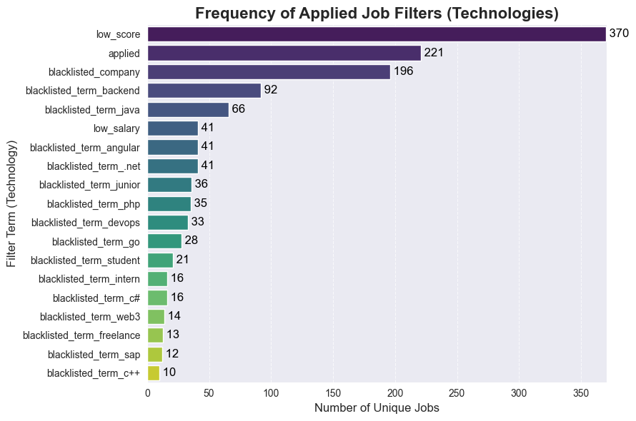
Conclusion: Approximately each 2nd job is filtered out due to low score (Glassdoor only), pre-application status, company blacklisting, or non-relevant terms in the title. This process saves significant time daily.
glassdoor_jobs = df[df['platform'] == 'glassdoor']
ln_jobs = df[df['platform'] == 'linkedin']
glassdoor_jobs_clean = df[(df['platform'] == 'glassdoor') & (df['filter'].isna())]
ln_jobs_clean = df[(df['platform'] == 'linkedin') & (df['filter'].isna())]

total_counts = [len(glassdoor_jobs), len(ln_jobs)]
clean_counts = [len(glassdoor_jobs_clean), len(ln_jobs_clean)]
labels = ['Glassdoor', 'LinkedIn']

viridis_colors = sns.color_palette('viridis', n_colors=4)
color_set = [viridis_colors[3], viridis_colors[1]]

fig, axes = plt.subplots(1, 2, figsize=(14, 6))
fig.suptitle('Job Count Comparison by Platform', fontsize=16, fontweight='bold')

axes[0].bar(labels, total_counts, color=color_set)
axes[0].set_title('Total Job Counts', fontsize=14)
axes[0].set_ylabel('Number of Jobs', fontsize=12)

for i, count in enumerate(total_counts):
    axes[0].text(i, count + 0.1, str(count), ha='center', va='bottom', fontsize=12, fontweight='bold')

axes[1].bar(labels, clean_counts, color=color_set)
axes[1].set_title('Jobs Without Filters', fontsize=14)

for i, count in enumerate(clean_counts):
    axes[1].text(i, count + 0.1, str(count), ha='center', va='bottom', fontsize=12, fontweight='bold')

max_y = max(total_counts + clean_counts) + 1
axes[0].set_ylim(0, max_y)
axes[1].set_ylim(0, max_y)

plt.tight_layout(rect=[0, 0.03, 1, 0.95])
plt.show()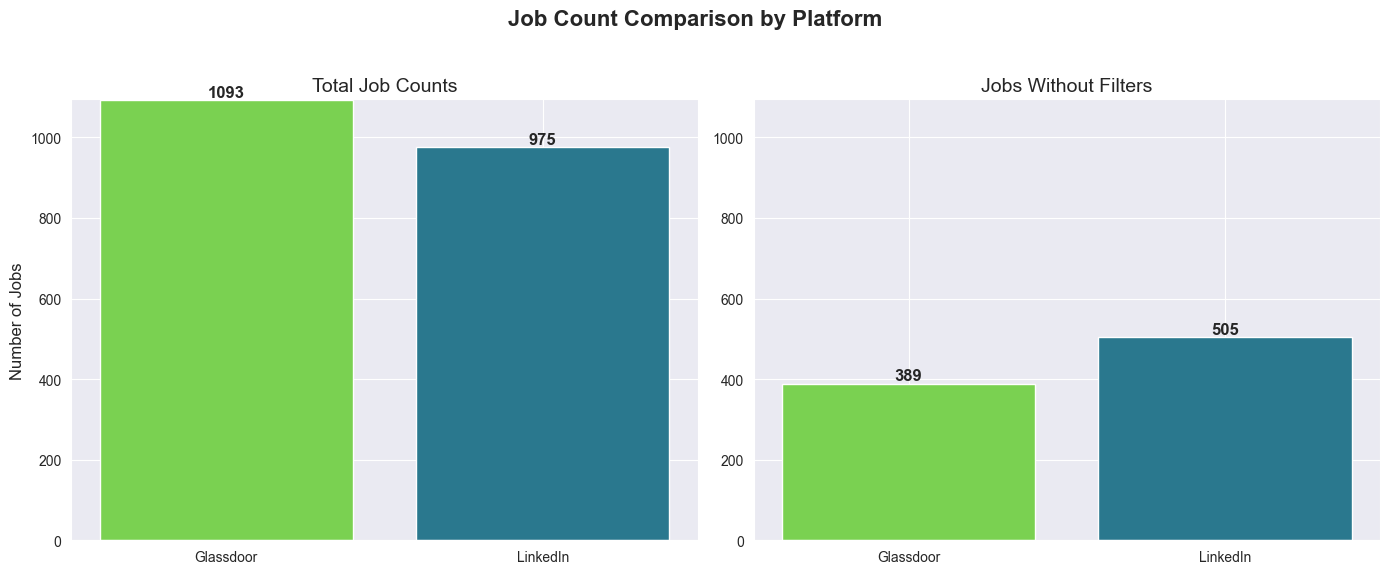
Observation: Both platforms yield a similar number of unique jobs (Glassdoor provides 118 more). However, LinkedIn jobs appear slightly more relevant (likely due to the scraper’s use of logical operators and/or the platform’s search quality).
Salary
Normalisation
Salary data comes in various inconsistent formats: 60.000 €, €58K/yr, €1,000/month, €50/hr and in USD $58K/yr, so we need to normalise and split it to different columns for easier sorting/use in data charts.
PS: will be moved to scraper logic later, but for now we do it here.
Also I will filter jobs with salary < 40k and > 120k as those are mostly intern, high-level EM/Staff positions or just US-based
USD_TO_EUR_RATIO = 0.86

def _clean_and_convert(salary_str):
    if pd.isna(salary_str) or salary_str == 'Not disclosed':
        return np.nan

    s = str(salary_str).lower()

    is_monthly = False
    if 'month' in s or '/mo' in s:
        is_monthly = True

    if 'hr' in s or 'pro stunde' in s:
        return np.nan

    is_usd = False
    if '$' in s:
        is_usd = True

    is_k_notation = 'k' in s

    s = re.sub(r'\(arbeitgeberangabe\)|\/yr|\/y|\/month|\/mo|\/hr|\$', '', s)
    s = s.replace('€', '')
    s = s.strip()

    if is_k_notation:
        s = s.replace('k', '')
        if is_usd:
            value = round(float(s) * 1000 * USD_TO_EUR_RATIO)
        else:
            value = round(float(s) * 1000)

        return value
    else:
        s = s.replace('.', '')
        s = s.replace(',', '')

    try:
        value = round(float(s))
    except ValueError as e:
        print(f'Error {e}')
        return np.nan

    if is_usd:
        return value * USD_TO_EUR_RATIO

    if is_monthly:
        return value * 12

    # fallback for unlabeled German monthly rates like '3300 €'):
    if not is_monthly and 1000 <= value <= 10000:
        return value * 12

    return value

def normalize_salary(salary_estimate):
    if pd.isna(salary_estimate) or 'Not disclosed' in str(salary_estimate):
        return np.nan, np.nan

    salary_str = str(salary_estimate).lower()

    if '/hr' in salary_str:
        return np.nan, np.nan

    parts = salary_str.split('-')
    parts = [p.strip() for p in parts]

    if len(parts) >= 2:
        min_val = _clean_and_convert(parts[0].strip())
        max_val = _clean_and_convert(parts[-1].strip())

        if not math.isnan(min_val) and not math.isnan(max_val) and min_val > max_val:
             min_val, max_val = max_val, min_val

    else:
        single_val = _clean_and_convert(salary_estimate)
        min_val = single_val
        max_val = single_val

    return min_val, max_val

#Debug part, TODO: these should be used for tests once the normalisation and split logic is moved to scraper
# print(f"'60.000 € - 95.000 € (Arbeitgeberangabe)' => {normalize_salary('60.000 € - 95.000 € (Arbeitgeberangabe)')}")
# print(f"'80.000 € (Arbeitgeberangabe)' => {normalize_salary('80.000 € (Arbeitgeberangabe)')}")
# print(f"'1300 € - 1500 € (Arbeitgeberangabe)' => {normalize_salary('1300 € - 1500 € (Arbeitgeberangabe)')}")
#
# print(f"'€58K/yr - €88K/yr' => {normalize_salary('€58K/yr - €88K/yr')}")
# print(f"'€1,000/month - €3,500/month' => {normalize_salary('€1,000/month - €3,500/month')}")
#
# print(f"'€32.1K/yr - €47.1K/yr' => {normalize_salary('€32.1K/yr - €47.1K/yr')}")
# print(f"'€10K/yr - €12K/yr' => {normalize_salary('€10K/yr - €12K/yr')}")
# print(f"'€50/hr - €65/hr' => {normalize_salary('€50/hr - €65/hr')}")
#
# print(f"'$58K/yr - $88K/yr' => {normalize_salary('$58K/yr - $88K/yr')}")
#End Debug

# add normalised salary columns
df[['salary_min', 'salary_max']] = df['salary_estimate'].apply(lambda x: pd.Series(normalize_salary(x)))
df['salary_avg'] = (df['salary_min'] + df['salary_max']) / 2
df['salary_err'] = df['salary_avg'] - df['salary_min']

# check outliers
# outlier_bottom_job = df[df['salary_avg'] < 40000]
#print(outlier_bottom_job[['job_id', 'job_title', 'company_name', 'location', 'salary_estimate','salary_min', 'salary_max', 'salary_avg']])

# outlier_top_job = df[df['salary_avg'] > 120000]
#print(outlier_top_job[['job_id', 'job_title', 'company_name', 'location', 'salary_estimate', 'salary_min', 'salary_max', 'salary_avg']])

# filter only data with salary
df = df[(df['salary_avg'] >= 40000) & (df['salary_avg'] <= 120000)]
Analysis
frontend_df = df[
    df['job_title'].str.contains(r'front', case=False, na=False) &
    ~df['job_title'].str.contains(r'full', case=False, na=False)
].copy().reset_index(drop=True)
frontend_df_ln = frontend_df[frontend_df['platform'] == 'linkedin']
frontend_df_gd = frontend_df[frontend_df['platform'] == 'glassdoor']

fullstack_df = df[df['job_title'].str.contains(r'fullstack|full stack|full-stack', case=False, na=False)].copy().reset_index(drop=True)
fullstack_df_ln = fullstack_df[fullstack_df['platform'] == 'linkedin']
fullstack_df_gd = fullstack_df[fullstack_df['platform'] == 'glassdoor']

def generate_plots(data_frame, title_prefix):
    if data_frame.empty:
        print(f"No data available for {title_prefix}. Skipping plots.")
        return

    plt.figure(figsize=(10, 6))

    bins_count = max(2, len(data_frame) // 2) if len(data_frame) > 1 else 1
    plt.hist(data_frame['salary_avg'], bins=bins_count, edgecolor='black', alpha=0.7, color=plt.cm.viridis(0.6))

    median_val = data_frame['salary_avg'].median()
    mean_val = data_frame['salary_avg'].mean()
    plt.axvline(median_val, color='cyan', linestyle='dashed', linewidth=1, label=f"Median: {median_val:.2f}€/yr")
    plt.axvline(mean_val, color='blue', linestyle='dashed', linewidth=1, label=f"Average: {mean_val:.2f}€/yr")

    plt.title(f'Distribution of Average Normalized Salaries for {title_prefix}', fontsize=14)
    plt.xlabel('Average Yearly Salary, €', fontsize=12)
    plt.ylabel('Frequency (Job Counts)', fontsize=12)
    plt.grid(axis='y', alpha=0.5)
    plt.legend(loc='upper right')
    plt.tight_layout()
    plt.show()

generate_plots(frontend_df, "Frontend Jobs")
generate_plots(frontend_df_ln, "Frontend Jobs LN")
generate_plots(frontend_df_gd, "Frontend Jobs GD")

generate_plots(fullstack_df, "Fullstack Jobs")
generate_plots(fullstack_df_ln, "Fullstack Jobs LN")
generate_plots(fullstack_df_gd, "Fullstack Jobs GD")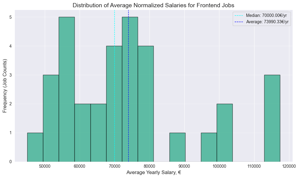
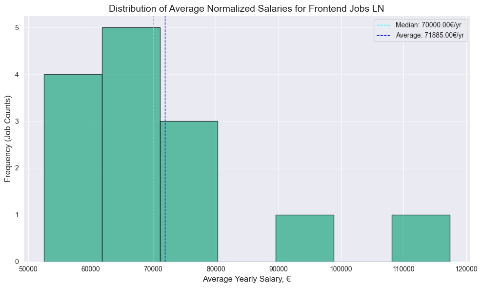
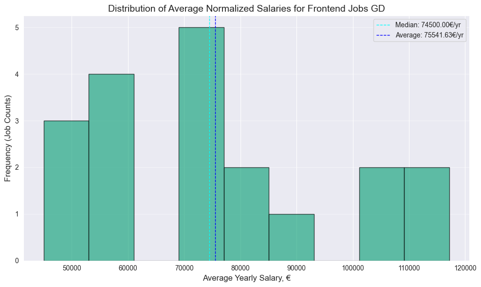
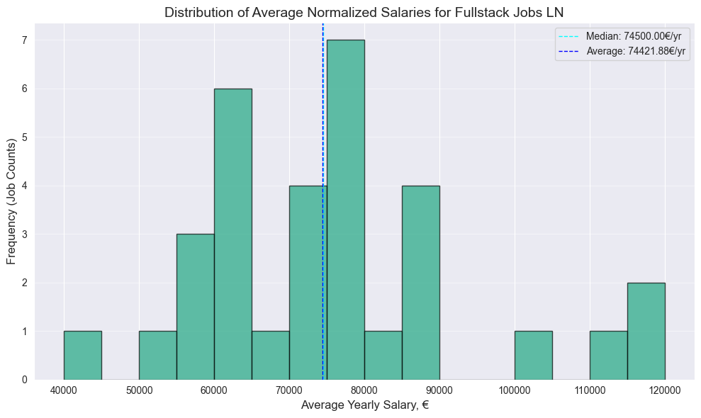
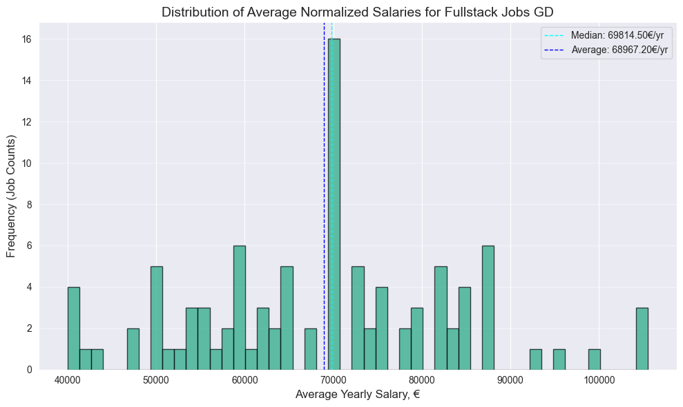
Note: Following points are to be interpreted as basic descriptive analysis with no statistical significance due to the relatively small size of the dataset. For more accurate data I suggest you to check salary reports on spesialised websites.
- Surprisingly no significant difference between Frontend and Fullstack median, both have 70k median
- 4.5k bigger Frontend median value on Glassdoor
- Surprisingly higher Fullstack median on Linkedin, by almost same 4.6k
PS: Should have more data next year, after the EU Pay Transparency Directive, which will require employers to disclose salary ranges in job advertisements across Europe, which should take effect by June 7, 2026
Or if you prefer box plot
comparison_data = pd.concat([
    frontend_df_ln.assign(Role='Frontend', Platform='LinkedIn'),
    frontend_df_gd.assign(Role='Frontend', Platform='Glassdoor'),
    fullstack_df_ln.assign(Role='Fullstack', Platform='LinkedIn'),
    fullstack_df_gd.assign(Role='Fullstack', Platform='Glassdoor'),
], ignore_index=True)

plt.figure(figsize=(10, 6))
sns.boxplot(
    x='Role',
    y='salary_avg',
    hue='Platform',
    data=comparison_data,
    palette={'LinkedIn': '#0077b5', 'Glassdoor': '#0caa41'}
)

plt.title('Average Salary Distribution by Role and Platform', fontsize=16)
plt.xlabel('Job Role', fontsize=12)
plt.ylabel('Average Yearly Salary (€)', fontsize=12)
plt.grid(axis='y', alpha=0.5)
plt.tight_layout()
plt.show()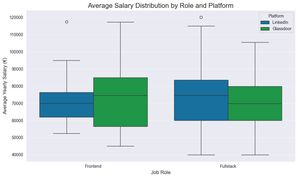
How to read:
- Bottom Whisker - Min, or the lowest salary offered in this category.
- Bottom Edge of Box - Q1, or 25% of jobs in this category offer a salary below this amount.
- Middle Line (The Median) - Q2, or 50% of jobs are above, and 50% are below this salary. The most important line.
- Top Edge of Box - Q3, or 25% of jobs in this category offer a salary above this amount.
- Top Whisker - Max, or the highest salary offered in this category.
- Dots (Circles) - Outliers, or data points that fall far outside the general distribution.
But the outcomes are same as above section.
Range Distribution
plt.figure(figsize=(10, 6))

sns.histplot(df['salary_err'].dropna(), kde=True, bins=15, color=plt.cm.viridis(0.6))

median_val = df['salary_err'].median()
plt.axvline(median_val, color='darkred', linestyle='dashed', linewidth=1, label=f"Median Range: {median_val:,.0f}€")

plt.title('Distribution of Salary Range (Max - Min)', fontsize=16)
plt.xlabel('Salary Range (€)', fontsize=12)
plt.ylabel('Frequency', fontsize=12)
plt.legend()
plt.grid(axis='y', alpha=0.5)
plt.tight_layout()
plt.show()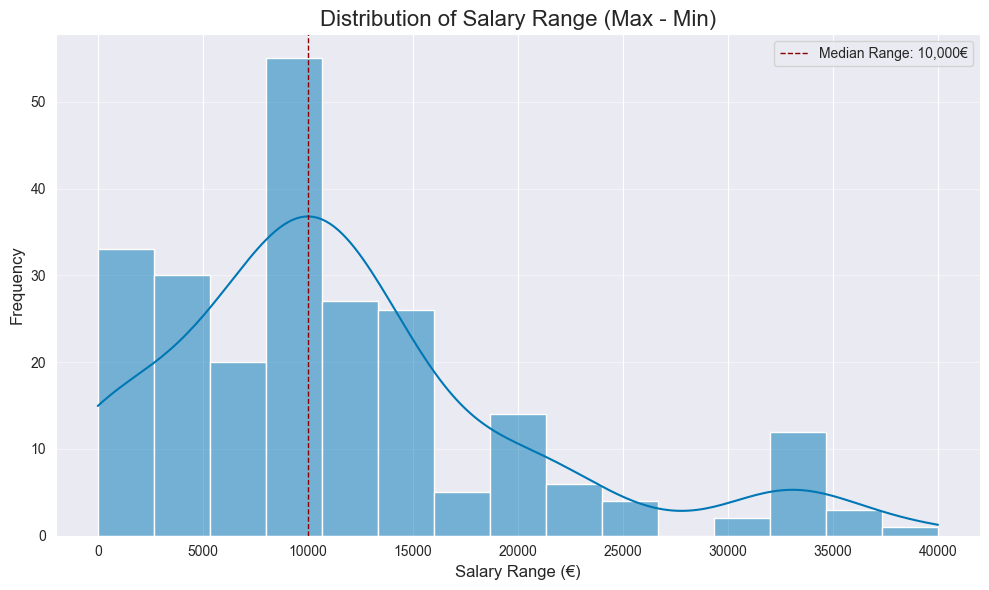
Median range is 10k. Wider range might indicate the company is more flexible or less certain about the exact salary for the candidate, giving you more negotiation room.
That it for now, thanks for reading!